
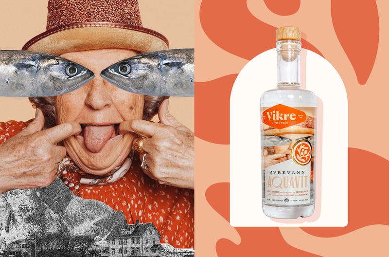
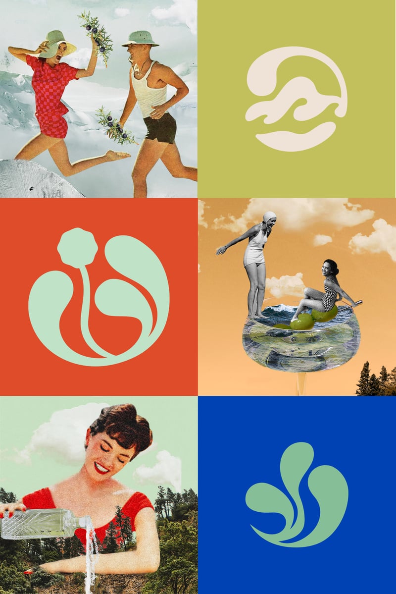
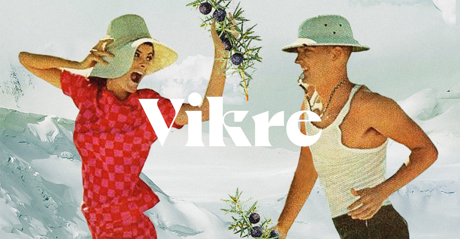
From hometown hero to industry standout, Vikre Distillery approached SMAKK to help them embrace the quirks of their roots in Duluth, MN and detail the integrity of their spirits.
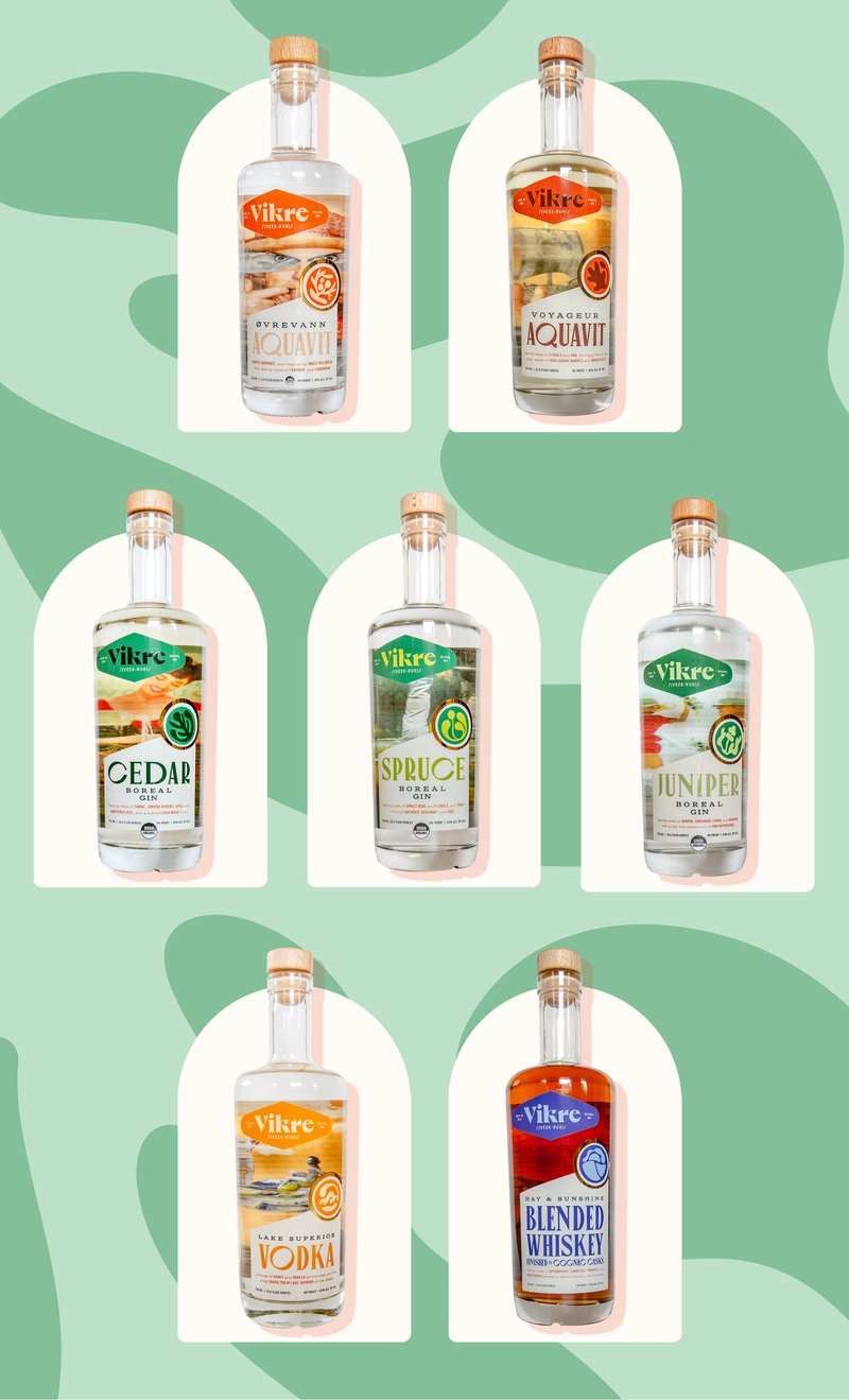
Vikre Distillery’s approach to spirits champions a triple bottom line: people, planet, and prosperity. We knew that their certified organic, zero-waste production, and locally sourced ingredients–from wild botanicals and grains, to water from Lake Superior– would support a premium positioning and give us the room to translate the eclectic character of Duluth into an easily recognizable and beloved brand identity both online and on shelf.
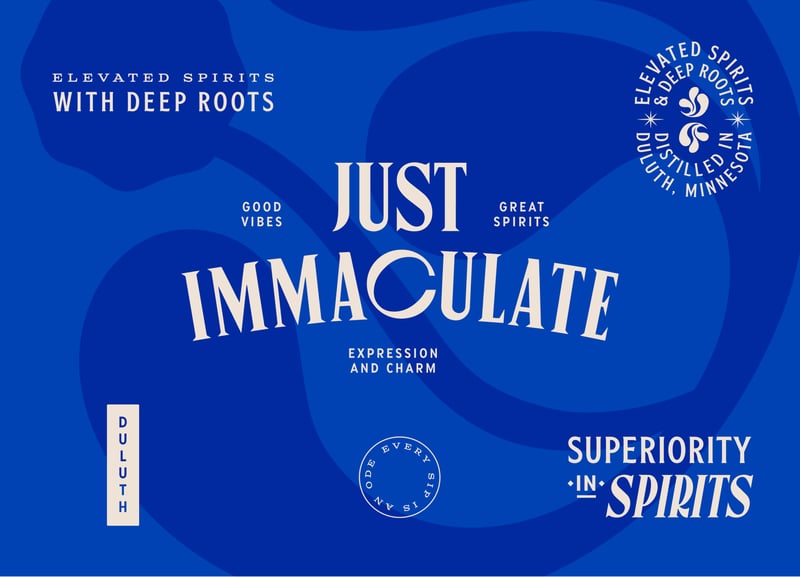
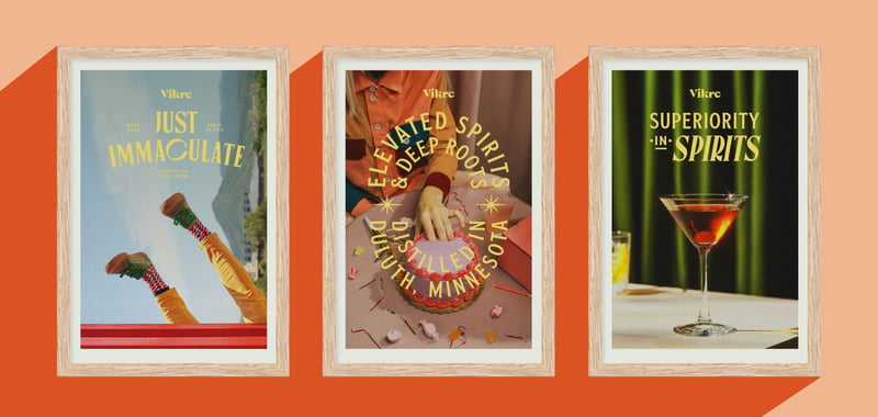
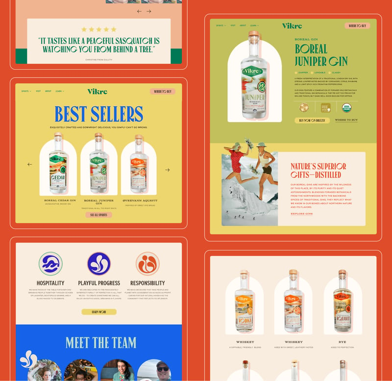
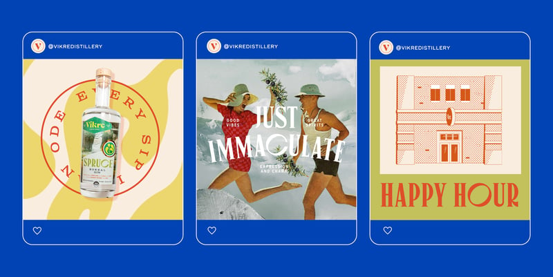
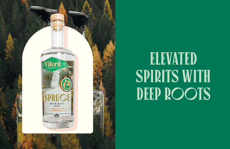
SMAKK led brand strategy, visual identity, messaging, and website and packaging design. We employed a suite of original illustrations, and playfully surreal collages to create a spirit-forward brand with metropolitan elegance, well-seasoned by the woods.
%201.png?width=532&height=610&name=Title%20Card%20(1)%201.png)